9 tricks for your Squarespace text blocks

Working with text on a Squarespace website isn’t the same as what you’re used to when working with text in word processing programs. Do-it-yourself website design is a drag-and-drop process, where you drop the design blocks you want on a page (text, images, buttons, and so on) and then move them around until they are placed the way you want.
Understanding how text blocks work and how they interact with other text blocks or with other design elements will help you shape your pages the way you want. It will also help you not to panic—as I did when I was learning—when you drop a text block on a page and it shifts everything else hither and yon and you have no idea why!

Text blocks are sticky on the top and bottom
With the older Squarespace editor, text blocks are like sticky buns
The most important thing to remember about text blocks is that they are sticky on their tops and their bottoms, sort of like a double-frosted sticky bun (which would be extra-delicious, come to think of it). If you create a second text block and place it under or above another one, the two text blocks will stick together and become one text block.
To make it a little more confusing, a sticky text block can contain both a heading and regular text, making it difficult to add something new into a long text block made up of headings and regular text.Also note that text blocks are not sticky side to side. When you place a text block next to another one, it stays as its own independent block.
If you’re still with me and haven’t had to run to a bakery for sticky buns yet, I’ll now give you a rundown of the tricks I use most often when working with text blocks on my clients’ websites.
Note: The Squarespace 7.1 Fluid Engine Editor works differently from previous editors. You drag each text block into place on the grid and check its placement on both mobile and computer displays. The text blocks do not stick together.
Trick 1: Squeeze in
Squarespace doesn’t have what you would call page margins. Instead it uses section widths. Pages full of text that goes the full width of a screen are hard to read, so I often narrow the width of a section to make long sections of text narrower and more readable.
You can also use spacers to change the width, but make them the same on either side of the text block for consistency. You’ll probably want to use the same size spacers as margins on other pages for a consistent text width throughout your website.
Left- and right-page spacers are often ignored when you look at your website on a cell phone because the narrow width of a cell phone screen automatically has a readable width.

When viewed on a computer, spacers create page margins and adjacent text blocks create columns
To find out more about spacers, read my blog post, “Spacers: Your website’s invisible super power,” which tells you more about how to use these handy design elements.
Note: With Squarespace 7.1 classic sections, you can create margins without spacers if you are working in a section. Adjust the width of the content to be narrower than the usual width. With the Squarespace 7.1 Fluid Engine Editor, you place elements on the grid where you want them to be.
Trick 2: Sidle up
To create text columns, drag text blocks next to one another. You’ll know you’re at the right insertion point when you see a short vertical line that marks the area next to the text block where you’re adding a second column.

Look for a short vertical line to know you’re placing a text block next to another one
Another way to use two columns is to help headings in a Frequently Asked Questions list stand out and to add some white space on your page. Use Column 1 for the questions and Column 2 for the answers. You can use a heading style for Column 1 to help it stand out.
On a cell phone, columns are placed one after the other, so you’ll want to check the cell phone preview as you’re designing a page to make sure the columns look good when they are stacked one on top of another.
Note: The Squarespace 7.1 Fluid Engine Editor works differently from previous editors. You drag each text block into place on the grid. The text blocks don’t have to line up. You should always use the Mobile preview and adjust the design for mobile if needed.
Trick 3: Shove over
To create an indent for one or more blocks of text, you can add a spacer to the left side of the text. Look for a short vertical line showing you that the spacer is going next to the text block only rather than being placed in a column that goes the full length of the page. Resize the spacer to be the size you want.
There is also an indent option on the text editing bar, but if it doesn’t indent the text to the degree that you want, you can use a spacer to indent the text any amount you want.

Add a spacer to the left of a text block to indent it
Note: The Squarespace 7.1 Fluid Engine Editor works differently from previous editors. You can drag each text block into place on the grid and create an indented effect by placing it correctly.
Trick 4: Buddy up
If you are trying for the effect of two columns, with a heading for each column, you’ll need to use the sticky trick to connect the heading and the column, so they are displayed on a cell phone as a single unit. After you’ve added new columns, drag Text Column 1 to stick under Heading Column 1 so they stay together as a unit. Do the same with Text Column 2 and Heading Column 2. When the columns are seen on a cell phone, Heading Column 1 and Text Column 1 appear first, followed by Heading Column 2 and Text Column 2.
Note: The Squarespace 7.1 Fluid Engine Editor works differently from previous editors. You drag each text block into place on the grid and check its placement on both mobile and computer displays.
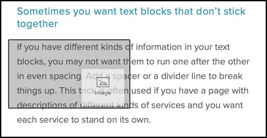
Trick 5: Split up

Use divider lines or spacers to break apart text blocks
Sometimes you won’t want the sticky rule to apply because you want text blocks to be independent of one another even if they are shown in one long column. I use this most often on Services pages when I want a way for each service to stand on its own and not be confused with any other service. To force space between text blocks, you can either add spacers or divider lines. Check the cell phone display as you’re trying out different splitting techniques. Sometimes spacers added in between text blocks cause more space than you want and you’ll have to compromise on a spacer size that looks good both on computers and cell phones or use a divider line instead.
Note: The Squarespace 7.1 Fluid Engine Editor works differently from previous editors. You drag each text block into place on the grid. The text blocks do not stick together.
Trick 6: Add in
If you need to add text in the middle of a long text block, drag a new text block to the place where you need to add it, watching for a short horizontal line showing that you have the correct insertion point. Type the new text in the text block. Style the text as a heading or regular text.
Occasionally the horizontal line showing the insertion point just won’t display at the point where you want it. In that case, add a new text block after the original text block and add your new text; style it the way you want. Then create another new text block, under the text block you just created. Cut the portion of the text from the original text block that is supposed to appear after your new text and paste it into the second new text block. You’ll now have everything in the correct order and the blocks will stick together when you save the page.
Note: The Squarespace 7.1 Fluid Engine Editor works differently from previous editors. You drag each text block into place on the grid. The text blocks do not stick together.
Trick 7: Center it
If you want to give an important announcement or testimonial center stage on a page, you’ll use spacers on either side of the text block, similar to how you create page margins. These spacers will be wider than any page margin spacers in order to create an even narrower text block.

Use wide spacers on either side of text to center it on a page
To restore the regular page margins after the centered text, add new side spacers to create the same amount of space for page margins as what is in use above the centered text.
Note: If you are using the Squarespace 7.1 Fluid Engine Editor, you drag each text block into place on the grid. You don’t need spacers.

Use SHIFT+ENTER to create a line break without extra line spacing
Trick 8: Tighten up
If you have a long list of items where each item on the list consists of a few short words, you can save space by tightening the line spacing between each line.
Normally, when you press ENTER after typing a list item, you’ll see a regular paragraph spacing. If you want to have less line spacing, you can hold the SHIFT+ENTER keys together to move to the next line, creating a line break rather than a paragraph break.
I use this trick when there is a long list that must be shown, each item on the list is short, and I don’t want to take up space on the page using a regular bulleted list or a numbered list.
Trick 9: Wrap around
Embed an image to make text wrap around it
To avoid a lot of white space under an image, you can force a long text block to wrap around the image. In this case, you aren’t working with the text block. Instead, you’re dragging an image block into the text block on the text’s right or left side until you see a full shadow rectangle embedded over the text block,
When you drop the image block, it is embedded in the text block. Drag the side of the image to force the image to a smaller size if needed.
Note: The Squarespace 7.1 Fluid Engine Editor works differently from previous editors. You drag each text block or image block into place on the grid.
Text blocks are the foundation of the messages on your website. Incorporating some of these tricks into your page designs will have you doing cartwheels (if only in your mind) as you position your messages exactly as you want them, so they are clear, readable, and memorable. Have I left any tricks out that you love to use? If so, I’d love to hear about them.