How colors and images express your website's personality
Merriam-Webster Dictionary defines personality as “a set of distinctive traits and characteristics.” Most of my clients are individuals running businesses on their own or with just a few employees. Their businesses—and their websites—are a reflection of who they are and what they love to do. In looking at the dozens of websites I’ve designed, I realized that the personality of a website comes across with the choice of three design elements: images, colors, and typefaces. In this post, I’ll show you some examples of clients’ websites that have different personalities. You’ll see how the choices of images, colors, and typefaces help define the website personalities their owners wanted to express.
Choosing your website’s personality
When I start with new clients, I send them a questionnaire that helps us define what the personality of the website will be. I ask them to choose three or four words that they want their customers to associate with them and their businesses.
Here are some words that I suggest as choices and clients often add their own descriptive words that I haven’t thought of:
Professional • Reliable • Creative • Trustworthy • Economical • Qualified • No-nonsense • Dependable • Experienced • Friendly • Relaxed • Knowledgable • Fast • Thorough • Down-to-earth • Approachable • Discreet • Careful • Specialist • Reassuring • Innovative • Authoritative • Artistic • Flexible • Healing • Complete • Restful • Educational • Mystical • Spiritual • Restorative • Fun • Busy • Rustic • Vibrant • Active • Environmental • Scenic • Social • Organic • Natural • Thoughtful • Youthful • Collaborative • Musical • Specialist • Luxurious • Urban • Minimalist • Safe • Transformative • Indulgent • Pragmatic • Inspirational
Do you see how choices like “Creative, Fun, and Artistic” will lead to a website that looks very different from a website whose personality is defined as “Professional, Reliable, and Knowledgable”?
Three design choices that define personality
Images
Website images should be chosen as much as possible as a set of images that look good together and have a similar perspective, such as all being photographed from the side as you would normally see a scene or all being flatlay photos where objects are arranged on a table and then photographed from above. The photos should have colors that use or complement the color palette you’ve chosen for the website. Although photos are most commonly used on websites, it’s also possible to use artwork or illustrations as long as they are chosen as a set of pieces that look like a set. If a color logo isn’t available for a website, I find that the large “hero” image chosen for the Home page often determines the color choices for the site.
Colors
The psychology of color is an area that has been studied in depth by marketers. Colors influence consumers’ impressions of marketing materials they see, including websites, and the actions they’re likely to take. I usually assemble a color palette of about four or five colors for a website. If there is a color logo already designed for the business, those colors will be part of the palette. Three colors of the palette determine the colors I set for body text, headings, and buttons. The fourth color is a complementary color that I reserve for use in decorative elements or to alert readers to a special opportunity or announcement. A fifth color might be used as an added background color in a section or a footer. Two or three of these colors will also be the dominant colors in the images selected for the website. Images may use other colors as well, but those other colors should go well with the colors chosen for the palette. Most body text on a website should be a dark color, either black or dark gray, on a light background. Using white or bright-colored text on a dark background should only be used sparingly for a bold effect because it’s harder to read. Colors used on websites are represented by a unique hexadecimal code, written with a # sign and then six numbers or letters, such as #ea0eb9 for bright pink or #000000 for black.
Typefaces
Typefaces chosen for text on your site can make a big impact on the website’s personality, while also complementing the colors and images. For both consistency and faster website loading, you should try to limit your typefaces to two on your website, unless you must have a third typeface to achieve a decorative effect for short pieces of text. I usually choose one typeface for headings and another typeface for body text. Then I use either of those same typefaces for the navigation menu text and button text, depending on what looks good. Headings should be readable and larger than body text. Body text should be large enough to be readable on both a cell phone and a computer. With Squarespace and Weebly, it’s easy to try out different typefaces for different design elements. I have fun trying different typefaces and fonts (the exact size and weight of a chosen typeface). Sans serif typefaces tend to look more modern and crisp, while serif typefaces with their decorative tails and feet are often chosen for their cultured, classic beauty. If I choose a serif typeface, I generally use it as a heading. I like to use a sans serif typeface for the body text because I think it’s easier to read online.
Sample websites
I asked three of my clients if I could share their websites for this blog post. These three websites have very different personalities and their choices of images, colors, and typefaces reflect that. You can click the pictures to go to the actual websites to see more of the details.
Amanda Kajen Live:
Active, Educational, Energizing, Professional

Amanda Kajen Live is the website for Amanda Kajen’s online fitness and personal training classes. It also highlights her expertise as a personal trainer.
Colors

Amanda Kajen Live’s website colors are vibrant and sharp.
Typefaces
Headings and Body text: Raleway
Sweetbriar Kennel:
Trustworthy, Friendly, Down-to-earth, Knowledgeable

Sweetbriar Kennel is a website for a husband-and-wife team’s small-scale home-based breeding program for the Italian hunting dog known as the Spinone.
Colors

Sweetbriar Kennel’s website colors mimic the cozy brown shades of the dogs’ coats. The client gave me this suggestion and it worked really well with their photos.
Typefaces
Headings: Adorn Smooth Condensed Sans
Body text: Cabin
The Fairies Chamber:
Creative, Artistic, Mystical, Natural
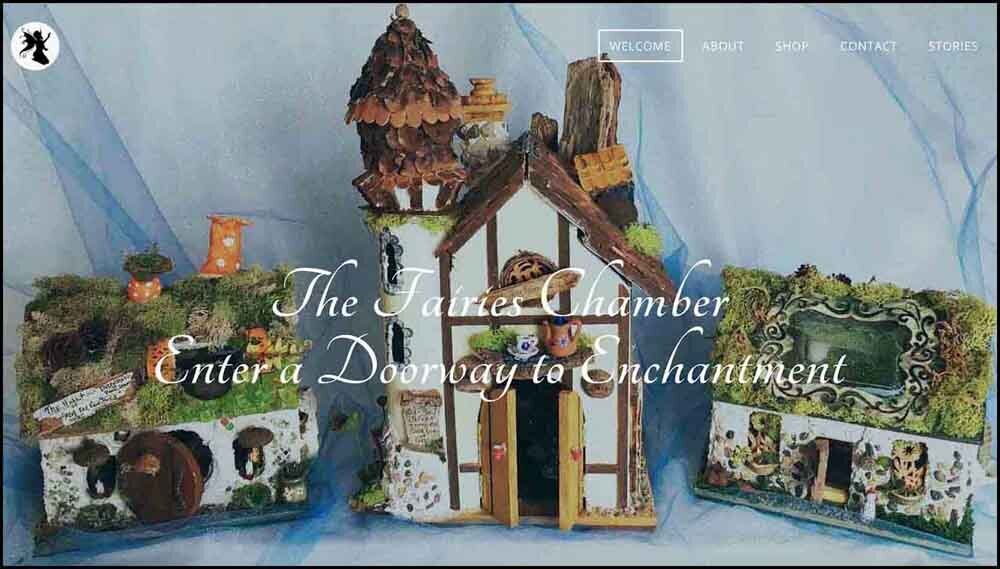
The Fairies Chamber is a showcase and online store for Andrea Riggillo’s artistic creations known as Fairy Houses. Her one-of-a-kind houses are made from found natural materials and adorned with her artistic touches.
Colors

The Fairies Chamber website uses colors from nature with purple added for a magical feel.
Typefaces
Decorative headings: Tangerine
Regular headings: Gentium Basic
Body text: Questrial
It’s my belief that a website should be designed to reflect the personality of the owner and the business, while also appealing to potential customers. If you’re designing your own website, first choose the descriptive words that define your website’s personality. Then as you experiment with images, colors, and typefaces, you’ll have a guide to ensure that your choices work together to give your website a magnetic personality that will attract your ideal customer.


