
How to pick the best banner image for your Home page
[Updated September 2022 with some more recommendations.]
Choosing the main banner image on the Home page of your website has repercussions for the colors, mood, and typeface choices for your whole website. Designers take a lot of things into consideration, including colors, size, and arrangement before choosing what's called a "hero image." To find the right image for your website, use four factors to make your decision: the subject matter, the colors, the space available for your message, and how the photo will look when cropped on a cell phone.
Find the right subject matter
A banner image can show a collection of your products, a picture of you, or the physical location of your business. It can also depict a scene that elicits the emotion you want customers to feel using your product or service or demonstrates the value they'll receive. The image doesn’t necessarily have to be a photo; it could also be an illustration that you find or that you hire an artist to create.
Feel free to use your own photos for a banner image
Don’t be afraid to take your own photos for a banner image. Cell phones take high-quality photos and your personal photos are authentic and unique to your business. Compose the photo as a horizontal image with enough space around it to do some cropping if needed. Eliminate any distracting background that isn’t relevant to the photo. Make sure the lighting is good and the focus is crystal-clear. It’s important to remember that only the central part of the image will be shown when your website is displayed on a cell phone, so be aware of what the center portion of the image is and make sure it will work well as the banner image.
Use stock photos if you don’t have your own photos
Most of the banner images I use for websites come from my favorite sources for free stock photos: Unsplash and Pixabay. If I can’t find a photo there, I have also purchased from Shutterstock.com, which has low prices for one-time projects and greater variety.
Choose the right colors
The colors of a banner image are very important. They should complement or match your logo colors (if you have a logo) and the colors of headings, buttons, and backgrounds on your website. When I’m designing a new website, I often find the banner image first and that determines the choices I make for colors.
Match the image colors with your website colors
If you are searching for a stock photo, you can use names of colors as keywords, such as “turquoise,” “fuchsia,” or “green.” There are also some fun color palette generators that let you upload an image and then see a color palette that could be used to match it with website colors.
Dogs inspired the website colors for Sweetbriar Kennel. We used their own home photos for the banners because their dogs are very photogenic, with coats of browns and beiges as their predominant colors. In looking at a few different color palette generators for this blog post, I uploaded the Home page image and generated a palette of colors that are found in the image. Although I had hand-picked the colors for the website, the results from Colormind.io were very similar. The color results are shown as hexadecimal values, the standard for web colors. If you were using these in your design styles, they are used with a hashtag first, such as #EID5C2 for the beige color shown in the palette below.

Leave room for your message
The banner image is the first image people see when they open your website, so it’s a perfect spot to highlight your message and a call to action. If you use the banner image as a background for text and other design elements, you’ll want to be sure that the text, buttons, or email signup forms you add are shown in a way that works for both desktop and cell phone displays. Note that it isn’t a requirement to add text to your banner image if you’d prefer that it make its own statement but it’s helpful for visitors to know right away what it is you do when they open the website.
On my Squarespace website, the navigation is part of the banner image. The main message and a button link to the Services page) are placed on top of the image. I also show social media and email icons at the top of the website for visitors’ convenience.

Consider the cell phone display
Both Squarespace and most other DIY builders create a responsive design, an automatic resizing of your website design to fit on different devices, including laptops, tablets, and cell phones. For cell phone displays, the banner image is cropped so the central part of the photo is the only part shown. You should use the mobile preview feature when designing your website to make sure the automatic cropping and the text and other design elements on the photo still look good.
As you can see, my website banner image shows only the central section of the banner image.
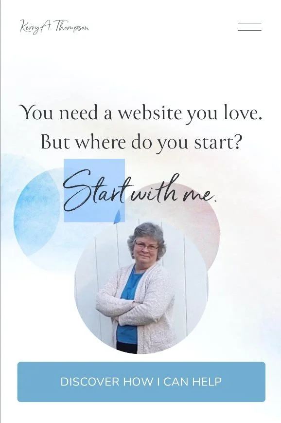
Banner photo on Home page is cropped when seen on a mobile device
Optimize your banner image before uploading it
Keep in mind these best practices for the final version of the banner image that you upload to your website.
Crop the image to eliminate any background that isn’t relevant and make sure the central part of the image looks good for the version to be shown on cell phones.
If you download a photo from a stock photo site, you can go with a size close to 1,920 pixels wide x 1,280 pixels tall (the medium size download on Unsplash or the large size on Pixabay). An aspect ratio of 3:2 seems to be a good goal. For original images, resize the image to be up to 2,000–2,500 pixels wide for Squarespace or 1,500–2,000 pixels wide for Weebly (and no fewer than 1,000 pixels wide). The height is flexible, but I usually end up with a Home page banner of between 1,000 and 1,500 pixels high. Be aware that the top and bottom of the banner image will probably be cut off in most displays, so preview the image in your website editor to make sure it looks good.
Resave the image as a .jpg file with the lowest quality that still looks clear and sharp. This reduces the file size and increases the speed with which the website loads. I try for file sizes of 100K to 200K if the image still looks good.
Can’t decide which banner image you like?
Agency designers and marketers use something called A/B testing, which is a fancy way of saying that they try out different versions of a design to see which one their customers prefer. If you’ve chosen a couple banner images and can’t decide which one to use, you can try one for a while and see if your website is being seen by more people and they’re visiting more pages on your website. You can also see if your call to action is successful (is it “converting” visitors?). Then try the other image you like and compare the results to decide which image is the one that your customers prefer.
What about banners on other pages?
I’ve focused on choosing a banner image for your Home page in this blog post, but many websites have banner images on every page. It’s up to you whether you want to repeat the same banner image on every page or have a different banner image on every page. I’ve tried both approaches on my website through different redesigns and find I don’t really have a preference. If you do decide to have different banner images for each website page, be sure that each image has the same style, look, and colors of the banner image that you’ve chosen for the Home page. Together they should form a matching set. Also note that the banners on other website pages are usually a little less tall than the Home page even if they use the same banner image. That allows the Home page image to make more of an impact.
Using these best practices, finding a banner image for your website can be a fun and creative process. And the right banner image can also turn casual visitors into interested readers first, which in turn leads to them taking action, such as booking a free consultation, subscribing to an email list, or buying your product.
My related blog post
7 pro tips for a perfect banner photo showing people
Articles by other authors
Hero images that boost conversions
Images that don't stink
How to choose colors for your website


