7 pro tips for a perfect banner photo showing people
I call the wide, eye-catching photo that appears at the top of a website page the “banner photo.” Some designers call it a hero image. I’ve already written about best practices for choosing high-quality, fast-loading images for these choice locations in “How to pick the best banner image for your Home page.”
7 traits of the best banner photo showing people
Finding a banner photo that shows one or more people has additional challenges. I've designed several websites recently where the banner photos show a person or group of people, which is what my clients preferred for their service-oriented businesses.
After some challenges finding just the right photos that would show the person or group without cutting off their legs or arms (yikes!), I realized there are specific qualities to look for in a banner photo. I’ve listed these tips here so you don’t have to spend a lot of time trying out banner photos from a stock photo site. These tips also help if you plan to use photos of yourself in banner images. Share these ideas with your photographer; photo shoots done for a banner photo need more planning than those done for regular, smaller photos placed on your website pages.

Example showing a good depiction of a person in a banner photo, along with examples that are too close or too tall
Go wide, not tall
The first requirement is the orientation of the photograph. You should take or select horizontal (landscape-oriented) photos. Vertical (portrait) photos aren't wide enough to show the person in full.
Find photos with lots of background
The unexpected thing about banner photos is that the website platform crops them (taking away part of the photograph around the edges). That means that your website will never show a banner photo in its entirety. To make things more complicated, what shows on a computer is a horizontally-cropped version of the photo. What shows on a phone is a vertically-cropped version of the photo. All that cropping means that you have to have a lot of extra stuff around the main subject (the person) to allow for this cropping.
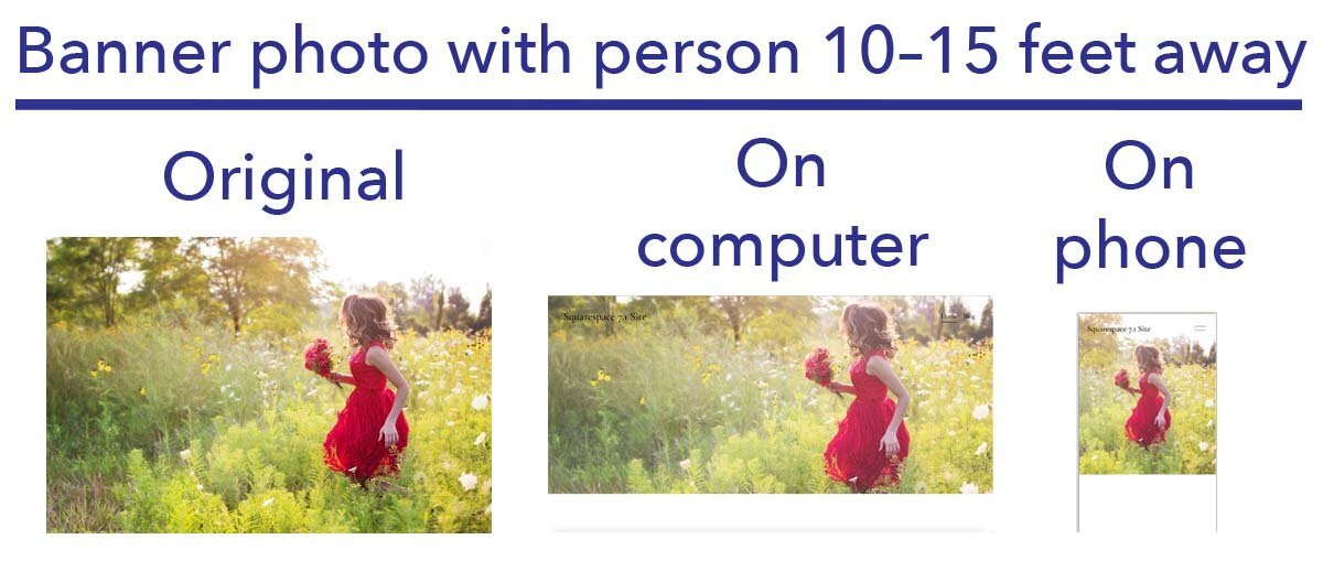
Banner photo with person about 10–15 feet away, as it looks in the original image and then when seen on a website
Don’t get too close
The person being photographed (and remember, it’s a horizontal shot) needs to be located at least 10–15 feet away from the camera, unless you want an extreme close-up only of the person's face. A photogenic client of mine had her husband take some great photographs of her in different settings. We were going to use them as banner photos. To our surprise, what would be a good photo for any other purpose, with the client standing about six feet away from the camera, resulted in some extreme close-up photos that were a little too overpowering on the page. If you’re not sure what will look good, it’s better to keep the distance greater than 15 feet and adjust the photo afterwards. If you’re choosing a stock photo with a person, you can use that distance recommendation as an estimate of how the photo will look when it’s placed in the banner.
Stay away from the edge
When the horizontal photograph is being taken, the person should be away from the extreme edges of the frame. While banner photos with one person often show the person on one side or the other, make sure that the person isn’t at the edge of the frame. If you want the person to be shown on the right or left side of the banner when it's placed on the website, they can be posed off-center, but leave enough background padding on all edges so the person won't be cropped out. If you’re choosing a stock photo with a person, you also want to look for photos where the person isn’t shown in the area next to the edge of any sides.
Focus on the person
The person’s image should be near or at the center of the photo when it is placed as an image in the banner. When a banner photo is shown on a phone, the image is cropped narrowly and vertically at the center point of the photo, so you want the phone to show some of the person in the banner photo. Sometimes you have to make compromises…perhaps not being able to show the person as fully on a phone as you do on a computer, but do the best you can to make the photo look good in both places.
In Squarespace, you can move the circle that defines what should be displayed as the photo’s center point after you've uploaded the image as shown in the picture below.

Move the focal point in the Squarespace image editor to change the location of the subject
Use the right size and shape
If you download a photo from a stock photo site for your website, look for a size close to 1,920 pixels wide x 1,280 pixels tall (the medium size download on Unsplash or the large size on Pixabay). With Squarespace, I usually try for file sizes from 1,500 to 2,000 pixels at the longest side. You're looking for an aspect ratio of about 3:2.
If you've had someone take a photo or need to adjust a stock photo you’ve downloaded, use an image editor like Preview on the Mac or Windows Paint to resize the photo to be close to the ideal size and shape.
Use a compressed .JPG file
For faster website loading, you should also use a .jpg format and compress the photo to be a smaller file size and lower quality with a program like tinypng.com.
Need a different perspective—closer or farther away?
Showing someone close up or farther away is a design decision that can work well in certain circumstances.
Showing a person closer
If you want someone to appear closer, the person’s body should take up more space and be larger in the photo than in the example shown above. The legs will probably be cut off when using this perspective, but if the top half of the person is the focus, then it will work well. Most (but not all) of my clients are too camera-shy to use this close-up approach for photos of themselves as banner photos, but I’ll often choose stock photos of an indistinct person facing away or to the side within about six feet of the camera.
Showing a person in the distance
Showing a person in the distance is also a strategy if the person is meant to be part of the landscape rather than the focal point of the banner photo. In this case, you’ll look for a photo in which the person’s body takes up less space than in the example shown above. Showing a person in the distance gives the photograph a personal touch rather than being solely a landscape or architecture scene.

Banner photo with person in distance, as it looks in the original image and then when seen on a website
Showing more than one person?
All the same rules apply that I covered earlier, but when you want to show more than one person, be aware that less of the background will be showing with all those people taking up space. The group should be poised away from the edge of the frame if you want them to be seen in full and they may need to be a little farther than 15 feet from the camera if you want to see a lot of the background.

Banner photo with a group of people excited about their new websites
Whether you use stock photos or photos of yourself for your website’s banner photos, you’ll save yourself some time by keeping these tips in mind. So go have some fun finding photos that add more “personality” to your website banners.


