Is your website responsive when smartphones are calling?

[Updated 6/10/23 with newer Squarespace features]
With so many people looking for information on their smartphones, it's critical that your website employs a responsive design. A website that has a "responsive design" responds to the screen size of the device the reader has and narrows or widens pages so information fits the width of the device. The smaller the device, the narrower the space that is available for showing your website pages.
In the early days of smartphones, website designers had to create alternate, much narrower versions of their website pages to show them in a reader-friendly way. Fortunately, these days, the do-it-yourself website design platforms like Squarespace create multiple versions of your website pages automatically. These versions accommodate many different screen sizes – from small cell phones to tablets, laptops, and large desktop monitors.
Previewing your page as a cell phone user will see it
Before you consider a website page ready to publish, check the page with the Mobile preview feature so you can see the page as a cell phone user will see it. Chances are that everything will look just fine, but it's a good idea to preview your website in the smaller size to make sure it looks good.
Squarespace mobile preview
In Squarespace, the Mobile preview is activated by clicking the Mobile Device Preview tool at the top of the editing window.
NOTE - With Squarespace 7.1, you also have the option to move design elements specifically for mobile. Those changes won’t affect the Desktop version of your website. If you’re using the Fluid Engine Editor, which shows you a visible grid when you’re moving design elements around, you should definitely preview on mobile. The Editor doesn’t always place design elements where you’d expect for mobile. But you can move them and add or condense extra space to make mobile-only design adjustments. After making changes, check the desktop version again to make sure you haven’t changed anything on the desktop version inadvertently.
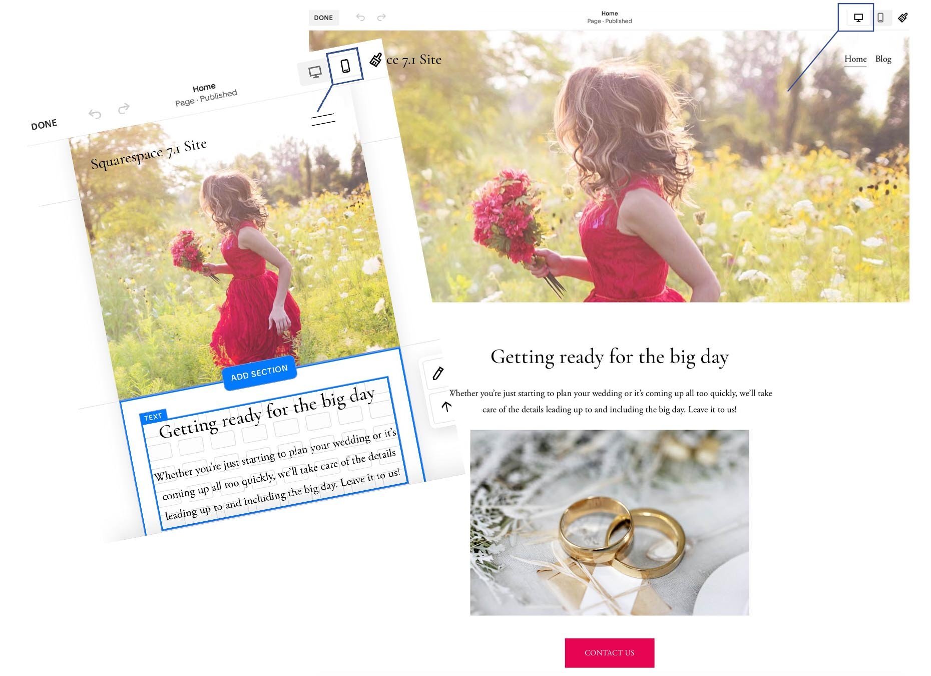
Previewing for a smartphone and a desktop computer on Squarespace 7.1
Open the website on a real cell phone too
The Preview feature in the website editor is helpful as you’re building a website. But you should also open the website on your cell phone to be sure that it looks good on a real phone too.
Mobile preview checklist
Here are some things to check to be sure your website works well for cell phone users:
Is there a manageable amount of text, so that it is comfortable for a cell phone user to scroll through and read?
Are the text font, size, and color you chose clear and readable?
Is it clear how to navigate to other pages on your site?
Are pictures an appropriate size?
Are text blocks in the correct order?
Are buttons visible and near the text that explains them?
If you see something that doesn't look right, adjust the overall page design so it looks good in the regular large size and in the narrower cellphone size.
With a clean responsive design, your website is ready to go for your on-the-go customers.


